
Inspiring color and design trends for 2015
![]()

COLOR AND DESIGN TRENDS 2015
Trends to consider when choosing window treatment colors for your home.
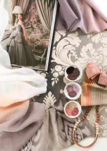
 The word is out; many trend and color organizations have announced their color of the year for 2015. While they may not all agree, the majority of them are announcing some shade of Marsala. But even if the choice is a blue or green, the overall trend we see is a warming of the colors. Colors that are steady, reliable, down to earth, and easy to live with and that will give a home warmth.

| Original content and images via Hunter Douglas |
Be Vervain: Brilliant Color and Shine

This season, Vervain introduces new textures and vibrant colors to its latest fabric collection. Inspired by India’s jewel-toned colors and sumptuous patterns, Montescano pays homage to the 17th and 18th century paisleys embroidered on Indian cashmere shawls. Complemented by an open, transitional drawing, Sequin Dream displays a simplified frame damask embroidered with sequins on a sheer organza ground.

| Original content and images via Vervain | Fabricut |
S. Harris: Geometric Balance

S. Harris continues to add innovative design with bold colors, remarkable textures and inventive patterns. With a modern “sweater-like†concentric box weave, Cover is a small-scale, multipurpose pattern and Suitable incorporates a synthetic raffia yarn within a chunky knit woven. Displaying a Moorish-inspired, geometric design in two-toned colorways, Oya adds a global outlook to interiors.

| Original content and images via S. Harris | Fabricut |
Kravet Presents: Pantone Color of the Year 2015 Fabric Collection.
![]()

To coordinate with the announcement of the PANTONE Color the Year 2015, Kravet has introduced a capsule collection of perfectly paired fabrics in PANTONE 18-1438 Marsala. From wonderfully textured neutrals to vibrant patterns and prints, this collection offers immediate options for interior designers interested in incorporating the PANTONE Color of the Year 2015 fabrics into current and future design projects.
According to Pantone, the impactful, full-bodied qualities of Marsala allow the color to be used alone as one grounded statement color or as a hearty accent to many other colors. This highly varietal shade combines dramatically with neutrals including warmer taupes and grays. Browns are a natural fit with Marsala – from beige, terra cotta and camel to deep delicious chocolates. Because of its burnished undertones, sultry Marsala is highly compatible to amber, umber and golden yellows, greens in both turquoise and teal, and blues in the more vibrant range. Marsala pairs exquisitely with monochromatic mixes of peachy pinks and sparkles against antiqued gold metallics.
| Original images and content via Kravet |
Join Our Family!
Take a Look
Interior Design Service
Inspiring Resources